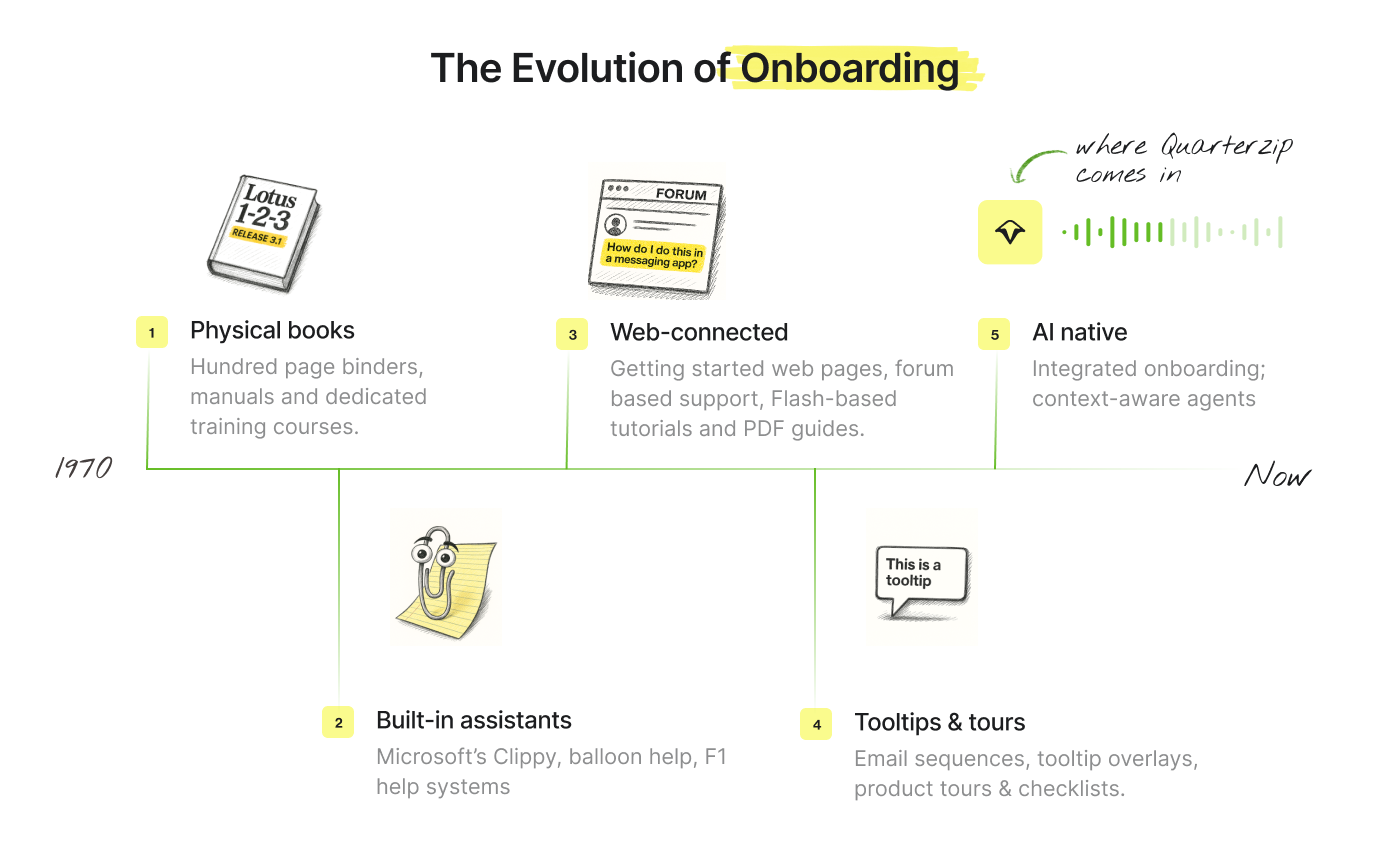
The Evolution of Onboarding
It's important to recognize that tooltips, like Clippy, had their time and place. Each software era introduced new interaction patterns that shaped user expectations, with previous methods becoming obsolete as technology evolved.
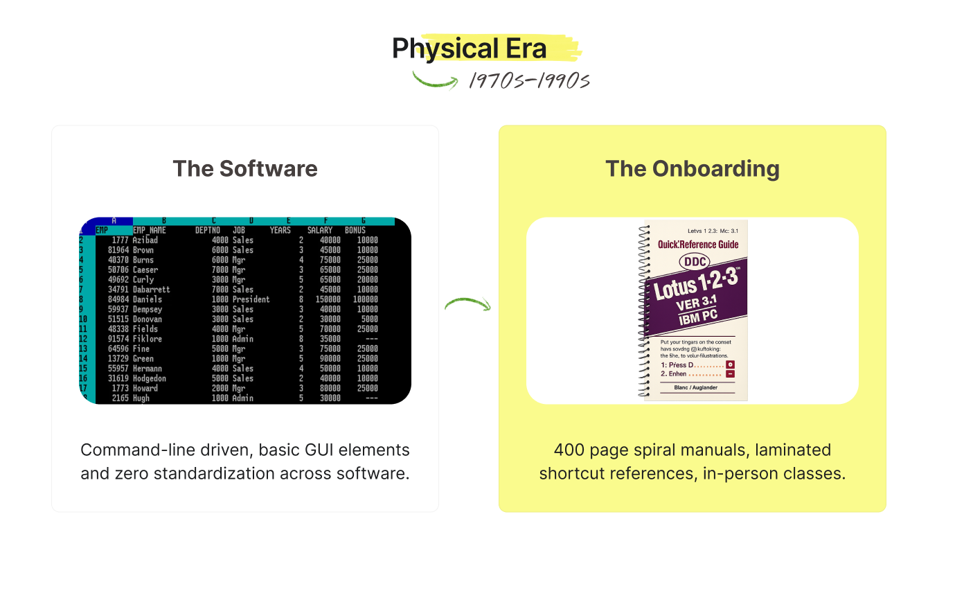
The Physical Era (1970s-1990s)
The Interface
Command-line driven with basic GUI elements. WordPerfect's cryptic reveal codes, Lotus 1-2-3's "/FS" keyboard shortcuts, and zero standardization across applications.
The modality shift: pure text terminals to sparse GUIs with minimal contextual information.
What Onboarding Looked Like:
- WordPerfect: 400-page spiral manual + laminated shortcut reference cards
- Lotus 1-2-3: "Getting Started" booklet + 600-page reference manual
- VisiCalc: Sample spreadsheet templates on floppy + budget creation tutorial
- MacPaint: Hand-drawn illustrations showing each tool's function
- AutoCAD: Multiple binders covering basic commands, advanced features, workflows
Why It Worked
Static software needed comprehensive documentation. For most users, this was their first encounter with software—akin to learning a completely new skill (does that sound familiar to what we’re experiencing right now with AI?). Simply booting up the program was already a challenge. Users at that time expected to invest weeks in proper study and learning.
From a business perspective, many of these software books were actually their version of a "free trial" where you could preview the software using the manual. Software shipped on disk remained unchanged for years, justifying the investment in thorough manuals.
This approach ended when update cycles accelerated and printing costs became prohibitive.
The Built-in Assistant Era (1980s-1990s)

The Interface
GUI-driven applications with standardized menus, dialog boxes, and early Windows conventions. Microsoft Office's ribbon hadn't arrived yet—users navigated through nested File/Edit/View menus. Software became more visual, but still required learning specific interaction patterns.
The modality shift: static documentation to interactive, contextual help systems embedded within applications.
What Onboarding Looked Like:
- Microsoft Clippy: Animated assistant offering proactive tips based on user actions
- Balloon help in Mac OS: Hover-triggered explanations for interface elements
- F1 help systems: Searchable databases with step-by-step procedures
- Interactive tutorials: Guided walkthroughs like "Cue Cards" in early versions of Word
- Context-sensitive help: Right-click menus and status bar guidance
Why It Worked
As computers moved from offices to homes, software companies faced a new challenge: their applications needed to work for millions of users, not just trained professionals. The GUI revolution made computers more accessible, but users still needed help navigating increasingly complex feature sets.
This era was driven by the recognition that software itself could teach users how to use it. Compared to flipping through manuals, the novelty of interactivity helped it feel magical.
Clippy succeeded because users were still in "learning mode" when approaching software. They hadn't yet developed the expectation of immediately intuitive interfaces. The assistant metaphor aligned with how people thought about getting help—you ask someone who knows more than you.
This approach ended when users became more sophisticated and began expecting software to be self-explanatory. The shift toward user-centered design made intrusive assistants feel patronizing rather than helpful.
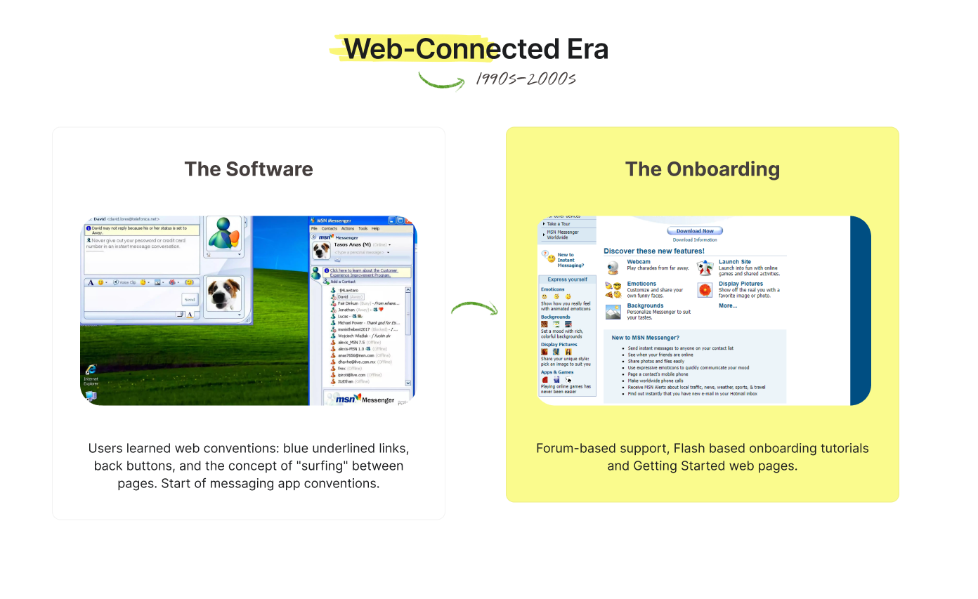
The Web-Connected Era (1990s-2000s)
The Interface
Browser-based applications and early web interfaces. Navigation through hyperlinks, form submissions, and page refreshes. Users learned web conventions: blue underlined links, back buttons, and the concept of "surfing" between pages.
The modality shift: in-application help to external internet-hosted resources and asynchronous communication (e-mail and forums).
What Onboarding Looked Like:
- Getting Started web pages: Dedicated portal sites with tutorials and FAQs
- PDF guides: Downloadable manuals that users could print or reference offline
- Forum-based support: Community-driven help where users learned from each other
- Flash-based tutorials: Interactive demos showing click-by-click workflows
Why It Worked
Unlike the static CD-ROM applications of the previous era, for the first time in human history, web-based software could be updated continuously. Companies could analyze how users actually navigated their applications and adjust both features and documentation accordingly. At the same time, the internet created infinite space for content without the constraints of physical media.
Users were already in "browsing mode" and comfortable consuming information across multiple tabs and sessions. Email sequences felt personal and timely—companies could guide users through features over days or weeks rather than overwhelming them with everything at once.
Most importantly, companies could finally separate their help content from their software release cycles. A bug in the documentation could be fixed instantly without waiting for the next software version or physical media shipment. This flexibility was revolutionary after years of being constrained by floppy disk and CD-ROM storage limits.
This approach ended when mobile usage exploded and context-switching between apps became friction. Users lost patience for external resources and began expecting guidance within the product experience itself. The rise of SaaS also meant companies needed faster activation to prevent churn—external onboarding was too slow for the subscription economy.
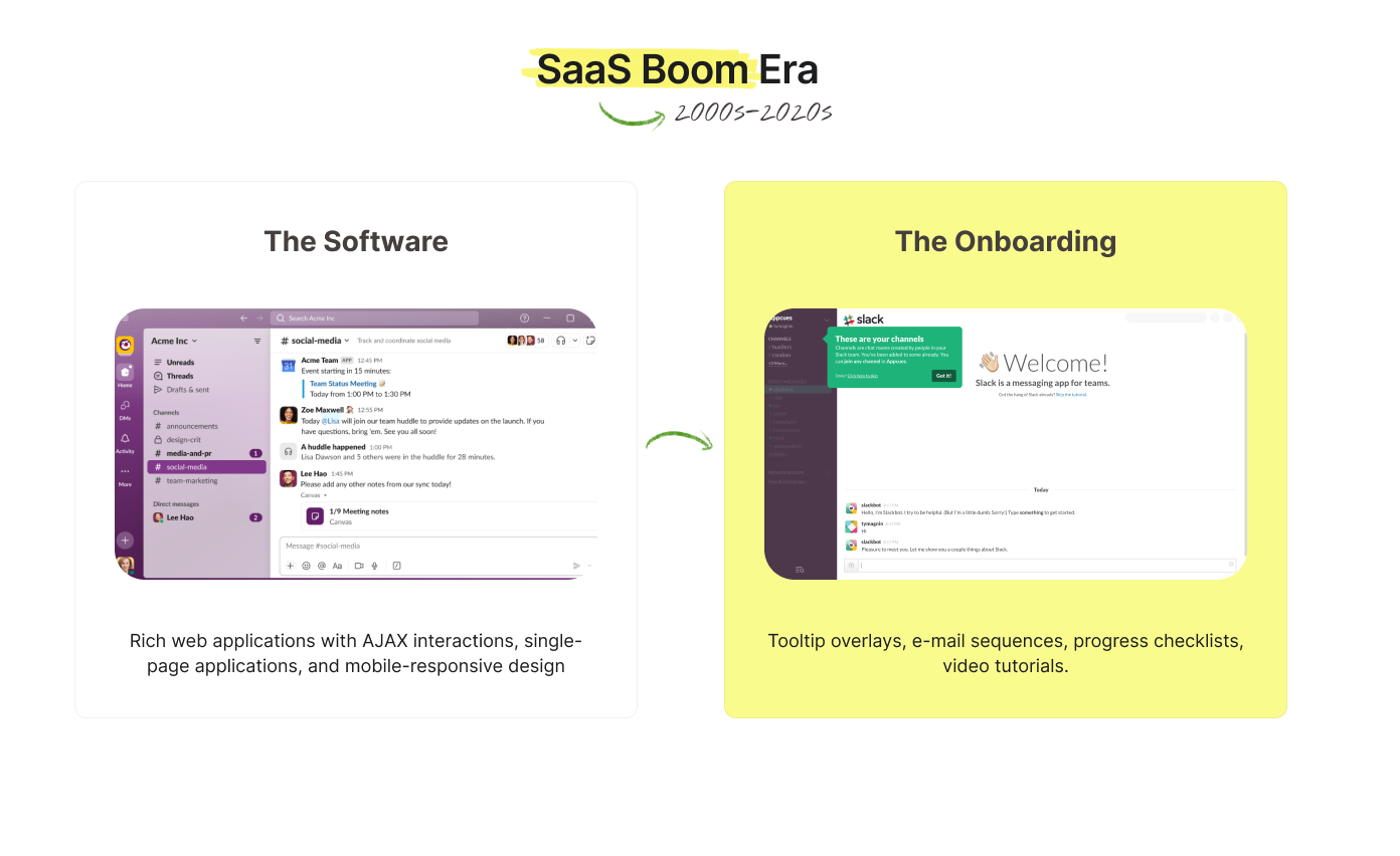
The SaaS Boom Era (2000s-2020s)
The Interface
Rich web applications with AJAX interactions, single-page applications, and mobile-responsive design. Software felt more immediate and app-like. Users expected instant feedback and smooth transitions between states.
The modality shift: external help resources to embedded, visual guidance overlays and interactive product tours.
What Onboarding Looked Like:
- Welcome email sequences: Multi-part series introducing features over days or weeks
- Tooltip overlays: Highlighted interface elements with explanatory callouts
- Product tour builders: tools like Appcues, creating step-by-step tours with progress checklists.
- Video tutorials: either created by other frustrated users or from the software company itself.
- Help docs: trawl through hundreds of pages of help docs to troubleshoot by yourself
Why It Worked
The subscription economy created perfect conditions for this approach. Users had developed sophisticated web literacy and expected immediate value from software—they were now "digital natives" exposed to countless applications. Visual overlays met users where they were—directly in the product interface—without requiring context switching. Progress indicators satisfied the psychological need for completion and achievement.
SaaS metrics drove optimization around activation and feature adoption. As software for measuring engagement matured, companies could track exactly where users dropped off in tours and iterate rapidly on onboarding flows. This approach reflected the broader shift toward user-centric design and data-driven development practices that have been transforming software development.